





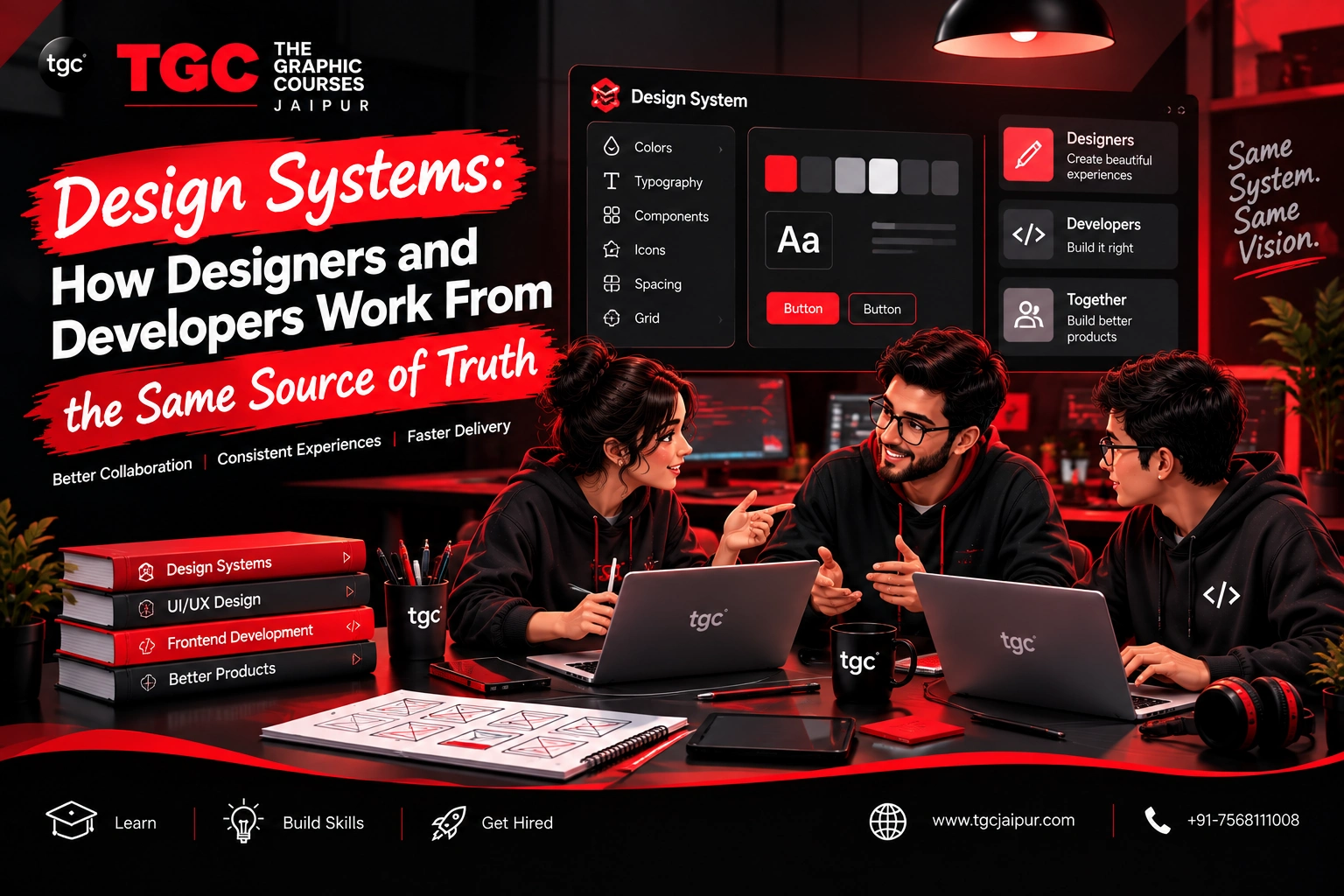
Design Systems: How Designers and Developers Work From the Same Source of Truth
Last updated on Sep 15, 2026


Introduction
Every designer has lived this moment: a button that looks slightly different on three different screens, a color that's "almost" the brand blue but not quite, or a developer building a component from an old screenshot because no one told them the design changed. These small inconsistencies aren't just cosmetic annoyances — they slow teams down, erode user trust, and quietly waste hours of rework every single week.
Design systems exist to solve exactly this problem. They give designers and developers one shared, single source of truth — so instead of guessing, checking, and re-checking, both teams build from the same defined set of components, styles, and rules. For anyone building a UI/UX career today, understanding design systems isn't a nice-to-have skill — it's quickly becoming a baseline expectation at any company building a real product.
This guide breaks down what a design system actually is, how it keeps designers and developers aligned, and why mastering this skill matters for your career.
What Is a Design System, Exactly?
A design system is a comprehensive set of reusable components, guidelines, and standards that both designers and developers use to build a consistent product experience. It's more than just a style guide or a component library alone — it's the combination of all three, working together:
| Component | What It Includes | Who Uses It |
|---|---|---|
| Design Tokens | Colors, spacing, typography, shadows — defined as reusable values | Both designers and developers |
| Component Library | Buttons, forms, cards, modals — built once, reused everywhere | Designers (in Figma) and developers (in code) |
| Documentation | Usage guidelines, dos and don'ts, accessibility notes | Both teams, especially new hires |
| Pattern Guidelines | How components combine into larger flows (navigation, forms, empty states) | Primarily designers, referenced by developers |
Think of a design system less like a static style guide sitting in a shared drive, and more like a living, evolving product in its own right — one that both design and engineering teams contribute to and maintain over time.
Why "Source of Truth" Matters So Much
Without a design system, designers and developers each end up maintaining their own separate, often outdated versions of the same information: a designer's Figma file says the primary button is one blue, while the developer's codebase has a slightly different blue hardcoded from three months ago. Neither is technically "wrong" — but neither matches the current source of truth, because there isn't one.
A design system fixes this by centralizing decisions:
- Design tokens are defined once (e.g.,
color-primary-500) and referenced everywhere — in Figma, in code, in documentation — so a single update propagates everywhere automatically - Components are built once, tested once, and reused across the entire product, rather than being recreated slightly differently on every screen
- Changes are versioned and communicated, so both teams know exactly when something has been updated and why
This is the real power of a design system: it turns "I think this is probably still accurate" into "this is definitely accurate, because we both look at the same source."
How Design Systems Change the Designer-Developer Relationship
For Designers
Design systems free designers from constantly rebuilding the same UI elements from scratch. Instead of designing a new button style for every screen, designers pull from an established component library — spending more time solving genuinely new design problems, and less time on repetitive production work.
Designers working within a mature design system typically:
- Use pre-built components in Figma (buttons, inputs, cards) that map directly to coded components
- Focus creative energy on new patterns and flows, not recreating existing ones
- Contribute new components back to the system when a genuinely new pattern is needed — following an established process for proposing and approving additions
For Developers
Developers benefit just as much, since design systems typically come paired with a coded component library — meaning developers don't have to guess at spacing, color, or interaction behavior from a static design file. They pull from a shared UI library (often built in React, Vue, or a similar framework) where these decisions are already implemented and tested.
Developers working within a mature design system typically:
- Import pre-built, tested components rather than building UI elements from scratch for every feature
- Reference the same design tokens used in Figma, keeping code and design values in sync automatically
- Spend less time on design QA back-and-forth, since components already match approved design specs
Popular Design System Tools and Frameworks in 2026
| Tool/Platform | What It's Used For |
|---|---|
| Figma (Variables & Components) | Building and maintaining the design-side component library and tokens |
| Storybook | Documenting and testing coded UI components in isolation |
| Style Dictionary | Managing design tokens across multiple platforms (web, iOS, Android) |
| Zeroheight | Creating shared design system documentation accessible to both teams |
| Popular reference systems | Google's Material Design, IBM's Carbon Design System, Atlassian Design System — widely studied examples of mature, well-documented design systems |
Studying an established, publicly available design system like Material Design or Carbon is one of the best ways for aspiring UX designers to understand how professional systems are structured and documented.
Common Challenges When Building or Maintaining a Design System
Design systems solve real problems, but they come with their own challenges that designers should be aware of:
- Keeping design and code in sync — without discipline, the Figma library and the coded component library can drift apart over time, recreating the exact problem the system was meant to solve
- Balancing consistency with flexibility — an overly rigid system can frustrate designers trying to solve a genuinely unique problem; an overly flexible one loses its value as a "single source of truth"
- Governance and ownership — someone needs to own decisions about what gets added to the system, updated, or deprecated, or it becomes an inconsistent mess over time
- Adoption across teams — a design system only works if designers and developers actually use it consistently, rather than reverting to old habits under deadline pressure
Why Every UI/UX Designer Should Learn Design Systems
Even designers who aren't building a design system from scratch will almost certainly work within one at any company with an established product. Understanding how design systems work helps designers:
- Work faster — pulling from existing components instead of designing from a blank canvas every time
- Communicate more effectively with developers — speaking the same language around tokens, components, and states
- Contribute meaningfully to system growth — proposing new components thoughtfully, rather than creating one-off designs that fragment consistency
- Stand out in interviews and portfolios — hiring managers increasingly ask candidates directly about their experience working with or contributing to a design system
How to Start Learning Design Systems as a Beginner
- Study existing design systems — explore Google's Material Design or Atlassian's design system documentation to see how professional teams structure tokens, components, and guidelines
- Practice building a mini design system in Figma — start with a small set of components (buttons, inputs, cards) using variables for color, spacing, and typography
- Learn basic front-end concepts — understanding roughly how components are coded (even without becoming a developer yourself) makes design system collaboration far smoother
- Document as you design — practice writing clear usage guidelines alongside your components, since documentation is often the most overlooked (and most valuable) part of a design system
Where to Build These Skills in Jaipur
TGC Jaipur's AI-Integrated UI/UX Design Course covers exactly these real-world, professional workflows — including Figma component libraries, design tokens, and building consistent, scalable design systems — alongside core UX principles like wireframing, prototyping, and usability testing. Students work on live, project-based assignments that mirror how real product teams operate, helping them graduate genuinely ready to collaborate with development teams from day one.
For students who want to strengthen the technical side of this collaboration further, TGC Jaipur's Web Designing Course covers HTML, CSS, and responsive design fundamentals — giving UX designers just enough front-end literacy to understand how their design systems actually translate into code.
Final Thoughts
Design systems have become the backbone of how modern product teams build consistent, scalable digital experiences — and they exist precisely to solve the disconnect between what designers intend and what developers build. For UI/UX designers, understanding how to work within, contribute to, and even help build a design system isn't just a technical nicety; it's a genuinely valuable, in-demand skill that signals real professional maturity to employers.
Whether you're just starting your UX career or looking to level up, investing time in understanding design systems — tokens, components, documentation, and governance — will pay off in nearly every design job you take on.
Ready to master real-world UI/UX skills like design systems? Explore TGC Jaipur's UI/UX Design course and get hands-on, project-based training designed to get you job-ready.
Recently Added Articles

.webp)







 Book A Free Demo
  7568111008
 Apply Now


 Please select course category